New Walmart logo
Posted: Sun Jun 29, 2008 9:32 pm
And they're getting rid of the hypen too:

I thought that was the nickname for Walt Disney World.jaybee wrote:They should just go with popular demand and change it to 'WallyWorld".
Trading the hyphen for an asterisk?Bob Juch wrote:And they're getting rid of the hypen too:
MarleysGh0st wrote:Trading the hyphen for an asterisk?Bob Juch wrote:And they're getting rid of the hypen too:
This has got to be some sort of sick joke. I figured it was a gag when I read the subject, but that picture doesn't present any sort of funniousity, so I can't see the point of photoshopping time.Bob Juch wrote:And they're getting rid of the hypen too:
Wally World is the Griswold vacation destination of choice.Sir_Galahad wrote:I thought that was the nickname for Walt Disney World.jaybee wrote:They should just go with popular demand and change it to 'WallyWorld".
You mean THIS IS TRUE? My God, what's next, the end of the Rollback? Please find your rag and give me the scoop on this.littlebeast13 wrote:MarleysGh0st wrote:Trading the hyphen for an asterisk?Bob Juch wrote:And they're getting rid of the hypen too:
The "asterisk" (there's actually a story about what it is and what it symbolizes and is supposed to mean to the customer in the latest employee rag, but I didn't pay much attention to it) is all over our signage and advertising, so it wouldn't surprise me if they are going to incorporate it into the new logo. It's part of the new corporate image facelift to be the place to save in the bad economy...
And I guess it wouldn't affect the "squiggly" part of the cheer since the hyphen had already replaced the squiggly a couple decades ago....
lb13
I'd go with one of the nicknames of the asterisk and change the lyrics to "Gimme a splat!"littlebeast13 wrote: And I guess it wouldn't affect the "squiggly" part of the cheer since the hyphen had already replaced the squiggly a couple decades ago....
Here's Fanny! wrote:You mean THIS IS TRUE? My God, what's next, the end of the Rollback? Please find your rag and give me the scoop on this.littlebeast13 wrote:MarleysGh0st wrote: Trading the hyphen for an asterisk?
The "asterisk" (there's actually a story about what it is and what it symbolizes and is supposed to mean to the customer in the latest employee rag, but I didn't pay much attention to it) is all over our signage and advertising, so it wouldn't surprise me if they are going to incorporate it into the new logo. It's part of the new corporate image facelift to be the place to save in the bad economy...
And I guess it wouldn't affect the "squiggly" part of the cheer since the hyphen had already replaced the squiggly a couple decades ago....
lb13
They must be working from East to West, because I haven't seen anything like that. Unless it's just the regular Wal-marts that are changing (I'm still stunned that your Wal-mart actually has hours other than '24-7').littlebeast13 wrote:Here's Fanny! wrote:You mean THIS IS TRUE? My God, what's next, the end of the Rollback? Please find your rag and give me the scoop on this.littlebeast13 wrote:
The "asterisk" (there's actually a story about what it is and what it symbolizes and is supposed to mean to the customer in the latest employee rag, but I didn't pay much attention to it) is all over our signage and advertising, so it wouldn't surprise me if they are going to incorporate it into the new logo. It's part of the new corporate image facelift to be the place to save in the bad economy...
And I guess it wouldn't affect the "squiggly" part of the cheer since the hyphen had already replaced the squiggly a couple decades ago....
lb13
I don't know if it's true or not (Though it looks like th elink to the photo is off the WSJ site, so it may very well be). I do know that all of our signing this year has changed over to that font and that goofy looking asterisk. I have not seen the Wal~Mart logo itself done like that, but a lot of the other stuff already looks like that....
lb13
MarleysGh0st wrote:I'd go with one of the nicknames of the asterisk and change the lyrics to "Gimme a splat!"littlebeast13 wrote: And I guess it wouldn't affect the "squiggly" part of the cheer since the hyphen had already replaced the squiggly a couple decades ago....
Here's Fanny! wrote:They must be working from East to West, because I haven't seen anything like that. Unless it's just the regular Wal-marts that are changing (I'm still stunned that your Wal-mart actually has hours other than '24-7').littlebeast13 wrote:Here's Fanny! wrote: You mean THIS IS TRUE? My God, what's next, the end of the Rollback? Please find your rag and give me the scoop on this.
I don't know if it's true or not (Though it looks like th elink to the photo is off the WSJ site, so it may very well be). I do know that all of our signing this year has changed over to that font and that goofy looking asterisk. I have not seen the Wal~Mart logo itself done like that, but a lot of the other stuff already looks like that....
lb13
To me, 'half an asterisk' subliminally translates to 'half-assed'.littlebeast13 wrote:I will have to look at that story again when I get to work tonight and see what the deal is with the asterisk. I know that sometimes it is only half an asterisk, and that's supposed to have some kind of subliminal meaning to the customer too....
lb13
Not that I've seen. The newer ones (which are the closest to me since I moved it on up to the east side) have "Lower Prices. Always" in script on the building. But I don't notice things a lot of the time.littlebeast13 wrote:No funny powder blue signs with asterisks and boldly proclaiming "Save Money, Live Better!" in your Mecca? I find it hard to believe it's not company wide by now.
Credit where it's due. That was funny.Bob Juch wrote:Yes, this is for real. I'm sure some company charged Walmart* a few million for the new design and its customer opinion testing.
As for what the asterisk means, you'll have to read the fine print.
Here's Fanny! wrote:To me, 'half an asterisk' subliminally translates to 'half-assed'.littlebeast13 wrote:I will have to look at that story again when I get to work tonight and see what the deal is with the asterisk. I know that sometimes it is only half an asterisk, and that's supposed to have some kind of subliminal meaning to the customer too....
lb13
Not that I've seen. The newer ones (which are the closest to me since I moved it on up to the east side) have "Lower Prices. Always" in script on the building. But I don't notice things a lot of the time.littlebeast13 wrote:No funny powder blue signs with asterisks and boldly proclaiming "Save Money, Live Better!" in your Mecca? I find it hard to believe it's not company wide by now.
As fate would have it, I'm making a pilgrimage this afternoon, so I'll pay attention while I'm there. All of our stores are Super, though.
Yeah, what I meant was the only thing I ever notice is the writing on the outside of the building. I walk through the store in my own little world and don't pay any attention to anything. It took me forever to notice those dumb little tvs. But when I'm there today, I'm actually going to take a look at my surroundings for a change.littlebeast13 wrote:I was talking about the signage in the store.... on the displays, features, hanging from the ceiling, etc. Nothing on the outside of our building has changed (Other than the signs in the vestibule windows)...... yet!
lb13
Okay, here's my report. We have neither a squiggly nor a hyphen, we have a star! Wal*Mart, only not an asterisk, but a five pointed star. Maybe that's the Supercenter designation?Here's Fanny! wrote:To me, 'half an asterisk' subliminally translates to 'half-assed'.littlebeast13 wrote:I will have to look at that story again when I get to work tonight and see what the deal is with the asterisk. I know that sometimes it is only half an asterisk, and that's supposed to have some kind of subliminal meaning to the customer too....
lb13
Not that I've seen. The newer ones (which are the closest to me since I moved it on up to the east side) have "Lower Prices. Always" in script on the building. But I don't notice things a lot of the time.littlebeast13 wrote:No funny powder blue signs with asterisks and boldly proclaiming "Save Money, Live Better!" in your Mecca? I find it hard to believe it's not company wide by now.
As fate would have it, I'm making a pilgrimage this afternoon, so I'll pay attention while I'm there. All of our stores are Super, though.
Here's Fanny! wrote:Okay, here's my report. We have neither a squiggly nor a hyphen, we have a star! Wal*Mart, only not an asterisk, but a five pointed star. Maybe that's the Supercenter designation?
Here's Fanny! wrote:I'm such a dork that I even checked out on the opposite side of where I came in just to check out all possible signage. Over each door is a Save Money. Live Better sign with the asterisk/orange seed thing that you describe. And between the two down the front aisle are signs with the same slogan, but have pictures of people in various stages of enjoyment.
No other signs throughout the entire store. Which must be why I never noticed them before. Also, no signs of the BTS sale yet. But it would be pushing it when it was still June.
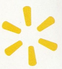
Oh, that'd be a really popular advertising line in Northern California, right now!littlebeast13 wrote: The Full Spark:
The full spark is our symbol for "smart". It represents the "spark of inspiration" that Mr. Sam had when he first started Wal~Mart and when he made smart choices for the company throughout its history. The hottest flame ignites with just one spark. So do great ideas.
So there you have what the spark stands for... courtesy of Larry Fine, Minister of Propaganda....